
Digital Dashboard Display: Data Visualizations
The availability of real-time data in today’s world is astonishing. Top organizations are using real-time data and building data visualizations to interpret the data to help guide the decision-making process.
What is data visualization?
In essence, data visualization is a way to represent information graphically, highlighting patterns and trends in data and helping the reader to achieve quick insights. (Gartner 2022)
Data visualizations can be used for a variety of business purposes across all parts of the organization.
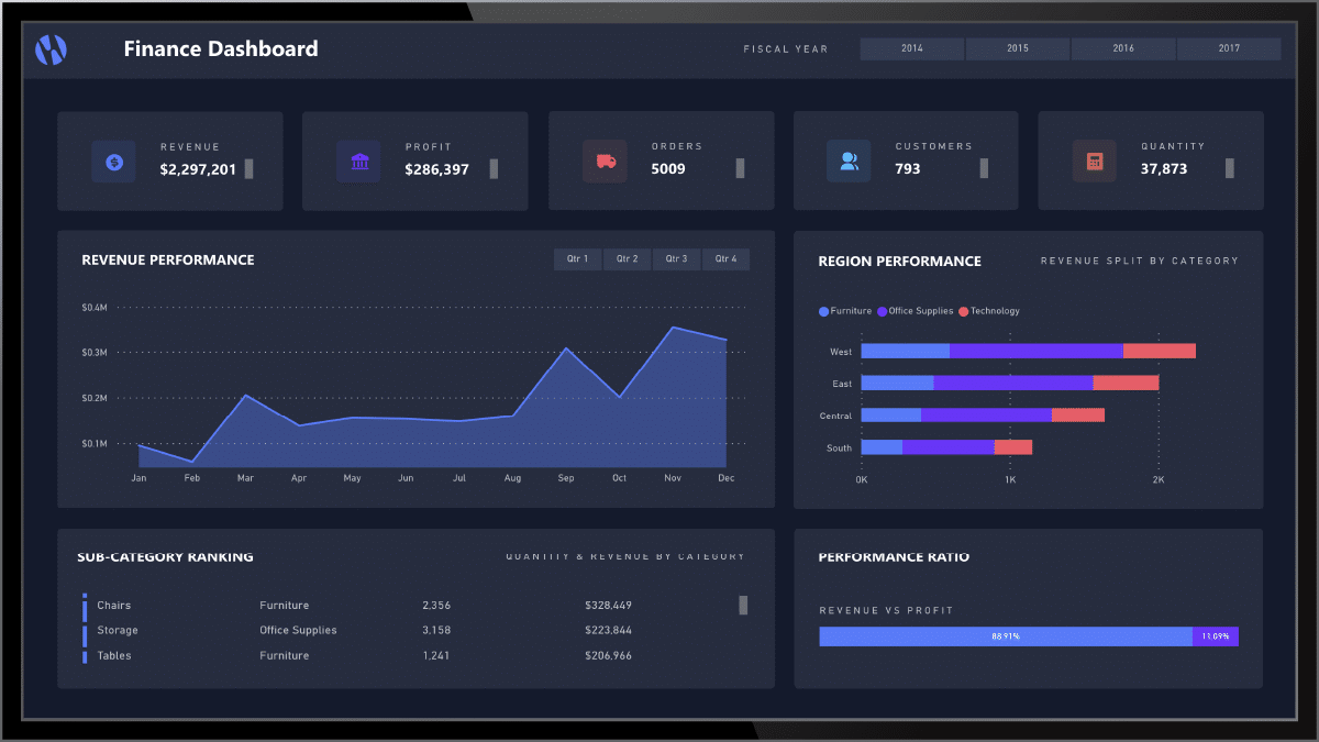
Financial results
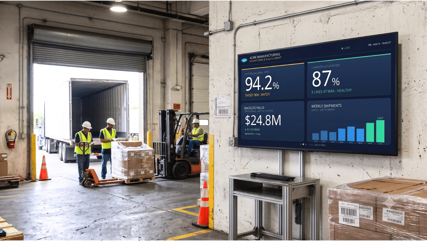
Companies of all sizes have a variety of ways to report financial results.
Whether it’s through spreadsheets, simple dashboards, or complex financial reporting, employees are more likely to be engaged if they understand how the company is performing.
When financial reports are displayed in real-time, your employees can see the immediate impact of decisions and changes they are making.
Consider, for example, when our marketing team invests in a major advertising campaign – we can display their marketing dashboard to watch how the campaign is performing, in real-time.
Previously, the marketing team and our leadership team would get updates at a certain point in time.
Now, we can truly watch as the campaign works and customers interact with it.
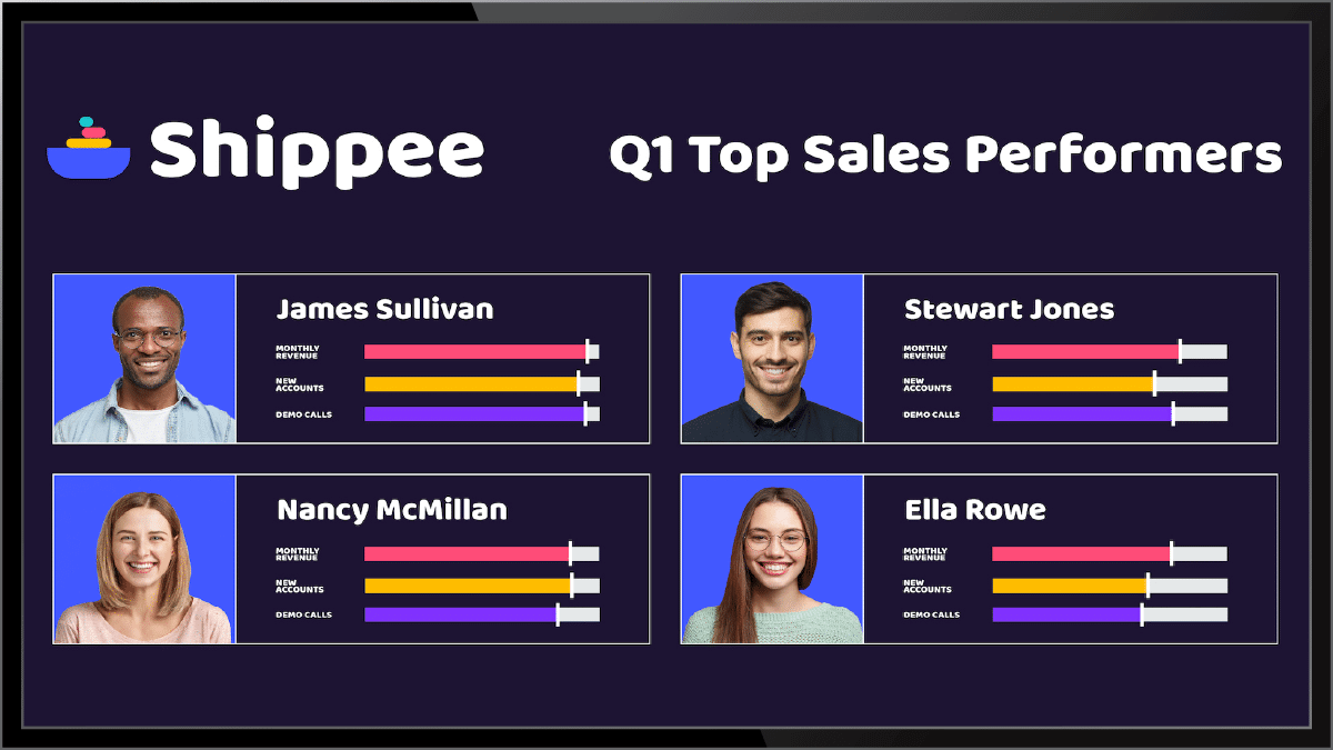
Financial results
Sales leaders – and employees – love leaderboards. It’s the gamification aspect that drives competition among the team and ultimately leads to greater sales.
Many gamification or leaderboard tools can be displayed via digital signage, making them visible throughout your sales office locations and ensuring that your sales team can see the information they need while they are hard at work, trying to make it to the top of that leaderboard.
Dashboards as a data visualization tool
One type of data visualization is a dashboard. According to Gartner, dashboards are a reporting mechanism that aggregates and displays metrics and key indicators so they can be examined at a glance by all possible audiences. It collects data and is able to provide an at-a-glance summary of an organization’s KPIs.
Who uses data visualizations or dashboards?
By visualizing data and trends, leaders can quickly and easily understand the information and if a business is on track to meet goals. Likewise, providing employees access to real-time data – whether it’s their own or company performance against goals – can help encourage them to meet or exceed the stated goal.
Product Development
Skykit’s own product development team – likely similar to yours – tracks our progress on sprints and deliverables. We use a variety of data visualization tools like Asana and Jira to track our progress. These two SaaS-based tools – like many others – come with data visualizations built-in.
When you display these on digital signage, everyone has access to the information about product development and can see how your team is progressing week over week. Team members can jump in quickly to help if they see an issue occurring. Or, conversely, everyone can celebrate when a team marks a major milestone.
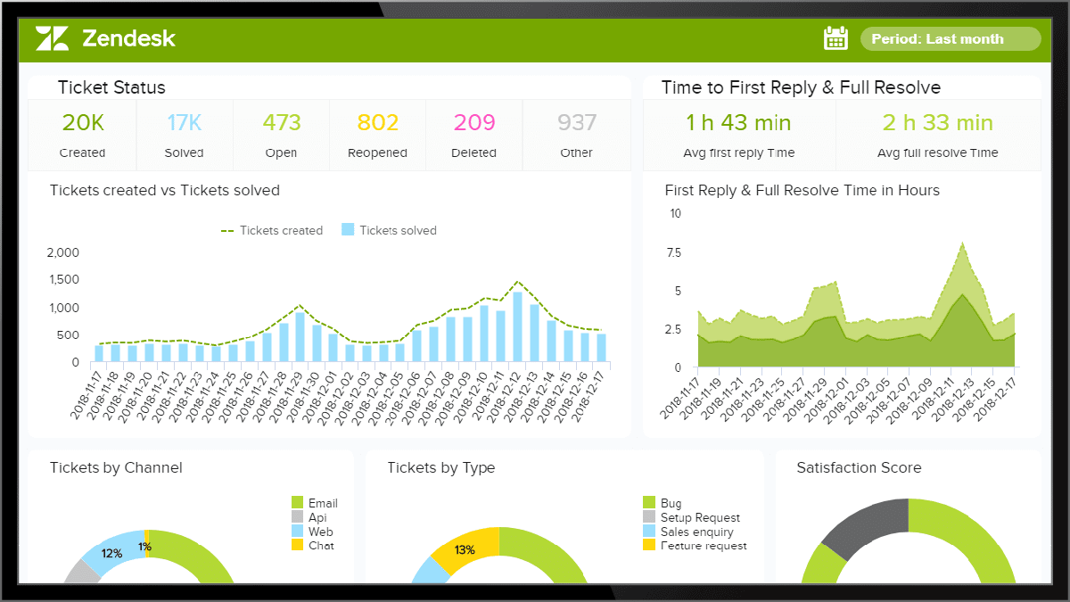
Customer Support
Your internal help desk or customer support team likely has a report or dashboard showcasing progress toward solving issues or tickets.
These reports can be a wealth of information – both for clients as well as for internal teams.
By displaying these dashboards on digital screens, employees can be aware of how many tickets a team member is working on as well as how many tickets have been resolved.
These data points can also help your employees understand what common issues are being reported so they can begin to work on a proactive fix to avoid additional issues.
What digital dashboard data visualization challenges exist?
One of the key challenges with current data visualization tools can be the limited reach of the tool and reports. The dashboards or visualizations can be unwieldy and difficult to protect and deploy at scale. Most tools require a single login for each employee, making them a 1:1 tool.
But, what about employees who aren’t in front of their computer every day or who operate in other systems? They often don’t get the opportunity to take advantage of the great real-time data being gathered and analyzed. This can lead to a great disconnect across the organization.
Sharing data across digital screens
Forward-thinking businesses are showcasing their data visualization tools and dashboards on screens throughout offices, call and support centers, manufacturing floors, or other employee spaces. But, often these deployments require manual updating and ongoing maintenance.
With rapidly advancing cloud technologies, companies can now connect their entire digital signage network to their favorite data visualization tools and share real-time and meaningful data with employees quickly, securely, and seamlessly.
That’s why we built Skykit Dashboard Connections, a secure, easy-to-use visual dashboard sharing and publishing tool for digital signage.
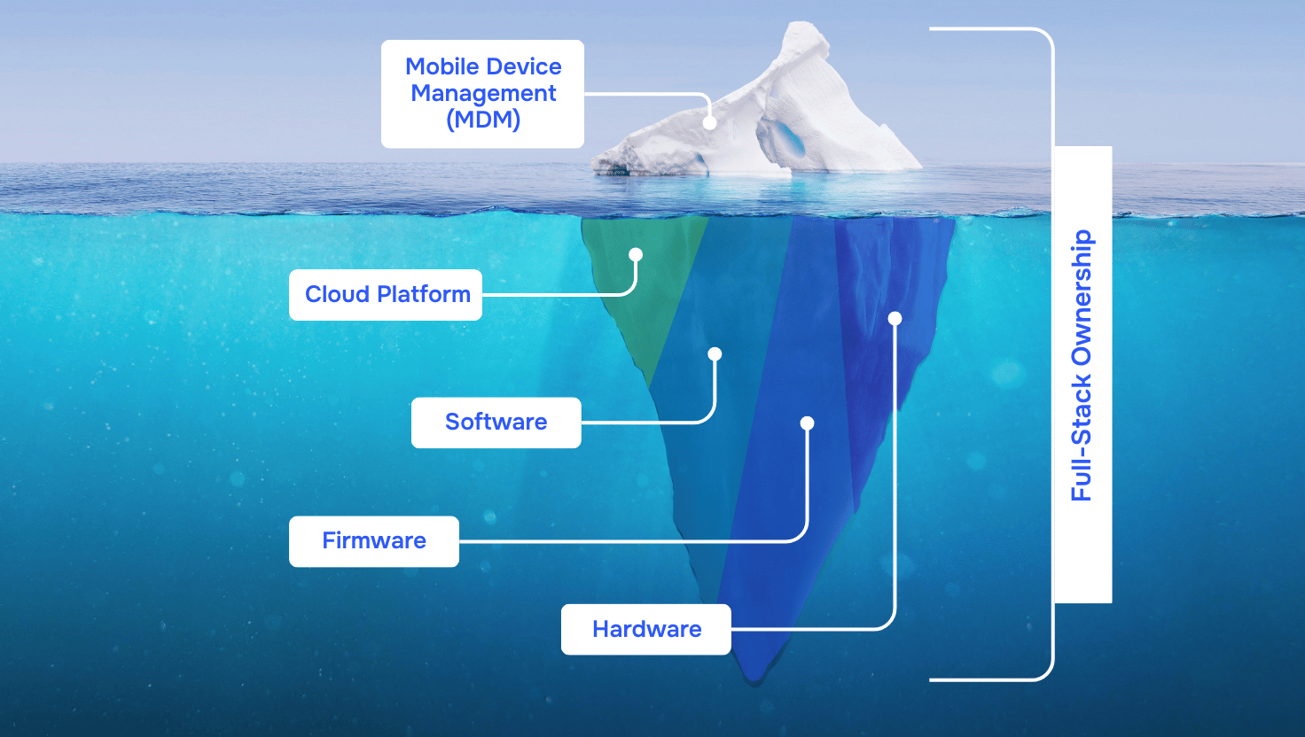
How Skykit Dashboard Connections Work
Skykit Dashboard Connections utilizes Skykit’s easy-to-use content management system (CMS), Beam, to put your data to work. Skykit dashboards work with SSO providers to utilize your existing logins to your data tools, like PowerBi, SalesForce, Looker, and more, to allow you to securely show your data on any display connected to your Skykit Beam CMS.
Let Skykit help you engage employees and showcase the most valuable data from the data visualization tools your organization already uses. Contact us today.


.svg)


