
With Skykit Dashboards, teams can display their data visualizations or internal data websites on any number of TVs or screens.
From machine health metrics to sales data, your organization’s numbers are constantly shifting. Skykit dashboard integrations offer you the opportunity to share your data and dashboards in real-time and ensure your team stays on track. Not sure if you have a dashboard? Don’t know what one is? Let’s go over some dashboard basics on how to create a digital dashboard and to help you capitalize on the data you already have.
What is a dashboard?
According to Gartner, a dashboard is, “a reporting mechanism that aggregates and displays metrics and key indicators so they can be examined at a glance by all possible audiences.” The report uses visualizations such as charts, graphs, funnels, and stoplights to help audiences process data more efficiently and make decisions based on the story told by the data.
Do I have access to a dashboard?
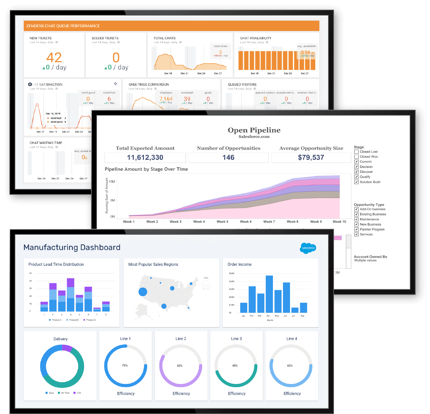
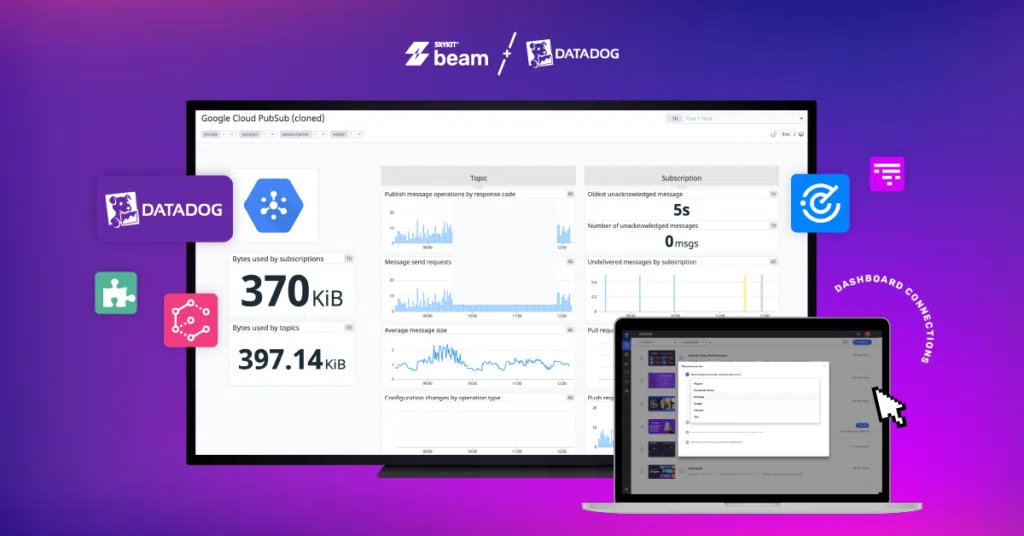
If you’re wondering how to create a digital dashboard, the first step is to see whether you have access. It’s likely you have a business tool that would allow you to build your own dashboard based on the data available. If you use a business tool such as Google Analytics, Salesforce, or Zendesk you can create a dashboard within the tools. Skykit dashboard integrations will then help you display your dashboard to your digital signage displays using our content management system, (CMS), Skykit Beam.
How to Create a Digital Dashboard
Define Your Objective
When you’re learning how to create a digital dashboard, a bit of planning goes a long way. Defining what story you want your dashboard to tell is the first step. Identifying the goal of the dashboard will help you select the metrics and data you wish to share. Everything you choose to display should help you achieve your goal.
Examine Your Audience
Who is your audience? It may seem like an obvious answer, but the answer will drive the metrics you wish to display. Factors to consider in defining your audience include what kind of dashboard you are building, where it will be displayed, and who has access to it.
Choose Your Metrics
So you know your audience and objective. Identify what your audience considers as a KPI. What indicators do they need to know and understand to help them drive smarter decisions? Limiting your dashboard to include 1-3 critical metrics will help make your dashboard easy to understand.
Know Your Display Size
Something like display size might seem insignificant or something you can decide at the end of your project, but it is critical to know to help guide the design process, so should be decided before you begin. One tip to help you avoid overcrowding or display issues is to design in your final display size.
You will then understand more easily how your audience will see the data as you are building it. Reducing the potential for it needing to be significantly redone.
Keep it Limited
Your audience wants to efficiently understand the story your dashboard is designed to tell. Too much data, color, graphs, filters, and views will distract your audience from the data they need to make smart decisions.
Industry best practices include limiting a dashboard to no more than 5-9 visualizations, limiting the number of colors to no more than 4-6, and limiting the filters you have available to 1-2. This will simplify the use of the dashboard for your audience members.
Format Considerations
There are so many kinds of awesome charts and graphs to choose from. Selecting a good option for your data can be challenging. Identifying why you need one is a good place to start. Consider how many variables, data points, and how you will scale your y-axis when selecting the style. These considerations will help you determine what kind of visualization is best. Also, consider your own preferences.
Collect examples of your favorites and use them to help drive how you build your solution.
Refine & Test
After designing your dashboard, it’s time to test to make sure your audience knows how to use it. Collecting feedback on your dashboard is essential to maximize the use of your dashboard.
A good place to start with the refinement process is to ask a sample of your audience to start using the dashboard.
You can ask for feedback to drive changes and enhancements. In addition to verbal feedback, you can even observe your audience using the dashboard. Having a visual understanding of their challenges with your dashboard can help you make additional changes that may not be otherwise communicated.
Go time!
After testing and testing your dashboard, it’s time to launch. Just because you launch your dashboard, doesn’t mean you are done. Now that you know how to create a digital dashboard, be ready to continue making changes as your data continues to change.
For help displaying your company’s dashboards, Skykit is here to help with our dashboard integration tool through Skykit’s award-winning, CMS, Skykit Beam. Connect with our dashboard experts to capitalize on your real-time data displays.
Social Media: Skykit dashboard integrations are now available to help you capitalize on your real-time data display investments. Not sure what a real-time dashboard is? Check out our blog on what is a dashboard and how to make your own to help your organization make the most of your data.


.svg)


