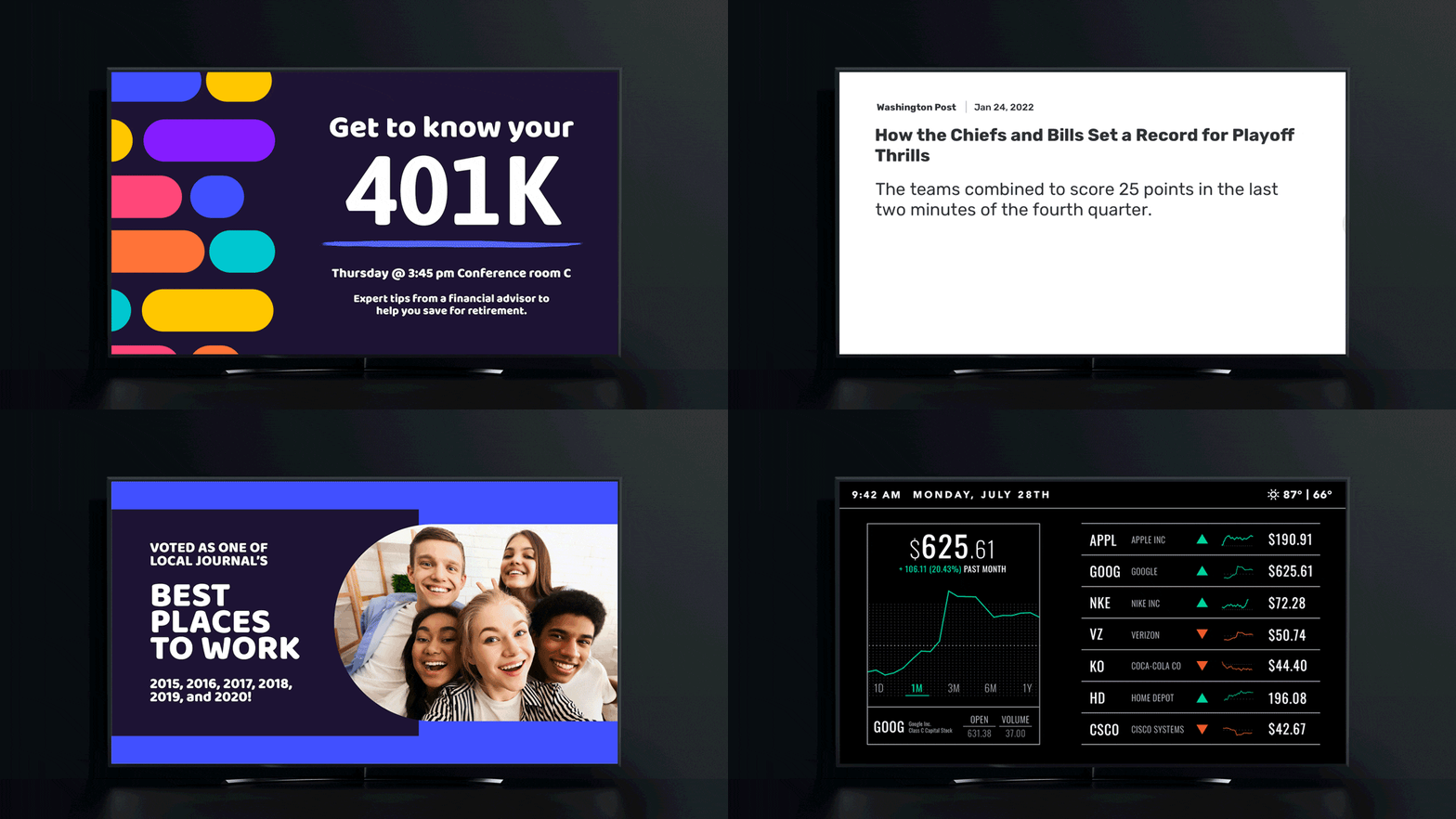
Digital signage content creation doesn’t have to be a stressful and daunting task, even for those without a background in graphic design. To help you in your digital signage journey, we’ve put together some best practices our design team recommends when creating content for both our headquarters and external clients. You’ll learn about design principles, some quick tips, and an easy-to-use design tool that will give you the flexibility needed to capture your viewers’ attention.
Effective Digital Signage Content: Know Your Canvas Digital Signage Display
Before you begin designing content for your digital displays, it’s important to take a step back and have a clear understanding of your digital canvas.
The first two things I determine about my displays are their resolution and orientation. Spending a few minutes to gather this information will save you from having to redesign your content over and over again, hoping to get the right dimensions and orientation each time.
From personal experience, I cannot tell you how many times I’ve created content in landscape orientation only to find out that the display I’m designing for is mounted as a portrait display.
Save your time (and your content team’s sanity) so you can direct your energy into creating beautiful, eye-capturing digital signage content for your viewers. P.S. If you want to save even more time by automating your content, check out our blog post about data-driven content.
Effective Digital Signage Content: Basic Digital Signage Design Principles
3×5 Rule
The 3×5 rule is a very simple design principle that can have a big impact on the readability of your digital signage content.
The 3×5 rule limits the amount of text you can show on your display by having you utilize three lines of text with five words on each line, or five lines of text with three words on each line. It’s easy to do and will make sure that your messages are not packed with too much text.
F-Shaped Pattern
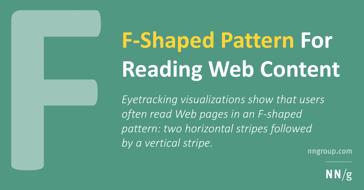
The F-shaped pattern is one of my favorite design principles.
This pattern was popularized by the Nielsen Norman Group (NN/g), a leading user-experience research and consulting firm. NN/g found that human eyes are trained to start reading at the top left corner of a page (or in our case a display), scan to the right horizontally, and then drop down to the next line.
This process is repeated until the viewer sees something they find interesting.
By accommodating people’s reading behavior by organizing your content and text around this principle, you enable your viewers to quickly read, comprehend, and engage with your message without missing a beat.
Quick Design Tips 
These basic design tips will bring your digital signage content to the next level. Use them in combination with the 3×5 rule and F-shaped pattern principle to ensure your content not only looks great, but remains readable as well.
Contrast and Legibility – be aware of your background and text colors. For optimum legibility, light-colored backgrounds should have dark-colored text, and vice versa.
Readability – a good rule of thumb is to use no more than two fonts when creating digital signage content. In addition, use fonts that are easy to read. Eccentric fonts can look great, but they are sometimes more difficult to read.
Simplicity – keep your message simple and to the point. Chances are, your digital displays will be rotating through a series of content, so be sure your messages are not only easy to read, but easy to comprehend.
Call-to-Action (CTA) – don’t forget to include a clear CTA, i.e. what you want your viewers to do after seeing your content. For example, if your content is sharing your Instagram feed, you can include text telling your viewers how to follow your social media account.
Preview, Preview, Preview! – it’s very important to preview the content on your displays before making it live. Stand at least six feet away from the displays (or at the proximity where your viewers will be located) and view your content. If it’s hard for you to understand, your viewers will also have trouble reading your content.
Find a Great but Simple Digital Signage Content Tool – now that you know your display, understand some basic key design principles, and learned some quick design tips, it’s time to put this new information to work! But before you can design and publish content, you’ll need a great design tool.
I’d love to be an expert in Adobe Illustrator or Photoshop, but it can take months, even years, to become proficient with these complex design tools. Fortunately, for us non-graphic designers, there’s a great tool called Pixelixe—an easy-to-use content designer that can be used alongside Skykit (see our Five Favorite Design Tools post for more information).
Pixelixe lets you add images, text, colors, change the background, etc., all with a few clicks. Visit the link above (or click here) to get started with Pixelixe.
So there you have it. We’ve learned that you don’t need a graphic design team to create great-looking content for your displays (though it never hurts). You just need patience, your imagination, and an easy-to-use content distribution tool like Skykit to get your newly-designed content published to your displays.
Don’t forget—some rules are meant to be broken. Experiment with different content designs and strategies to discover new ways to capture your viewers’ attention.

