Apple Keynote allows you to create beautiful, informative, and engaging slides.
Now, with Skykit Beam, you can display those slides on your digital signage throughout your location.
So, whether it’s back-to-school time, parent-teacher conferences, or other key events at your school, you can confidently share your Keynote slides. We offer the following five best practices for designing your Keynote presentation so it looks amazing on screens throughout your school.
Know your displays.
Knowing the size and orientation of your screen will help you make the best design decisions for your Apple Keynote presentation. Considerations Include:
Orientation
How will your display be oriented – Landscape or Portrait?
Sizing
Are you designing your presentations for a 14” monitor or a 65” display? This sizing question will impact the size of your font and imagery.
Content
While graphics and photography will be more engaging, we understand that you may have some messaging to share. Both screen size and orientation will impact how much content you should have on each slide. In general, smaller screens will allow for far fewer characters as you’ll want to make sure your font is large enough to be seen. Portrait displays will also allow for fewer words and shorter statements.
Skykit Beam Tip: When loading your Apple Keynote presentations to Skykit Beam, be sure to size your presentation to these dimensions: Width: 2560 pts and Height: 1440 pts
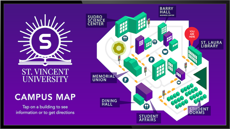
Keep it simple.
You’ll want to focus on one message per slide to keep your audiences engaged. Choose your text carefully in order to communicate the message effectively. Standard guidance indicates there should be no more than 6 words per slide, if possible.
Font:
Use a simple and easy-to-read font. And, use only one font type per slide.
Imagery:
Select one image to support each message. Multiple images could lead to conflicting messages.
Colors:
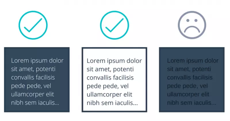
Color Combinations Can Make Your Designs Easier (or Harder) to View:
- DO overlay colors with varying values for readability.
- DO use backgrounds with consistent color schema.
- DON’T overlay light-on-light or dark-on-dark.
- DON’T use neon or rainbow designs.
Make sure your text and background colors contrast:
To make your text easy to read and to avoid causing eye strain, there must be a high contrast between your text color and your background color. It is also important to account for color-blindness. Choose either a dark font color on a light background or light text on top of a dark background.
Consider common color associations:
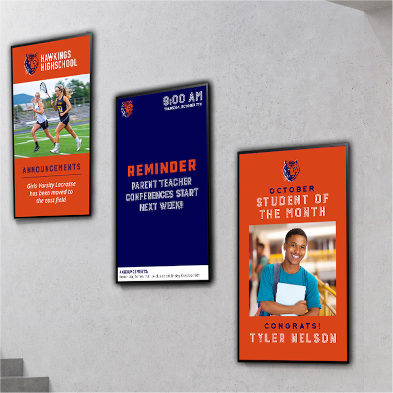
Think about the emotions and attitudes associated with different colors:
- Red: energy, power, passion
- Orange: joy, enthusiasm, creativity
- Yellow: happiness, intellect, energy
- Green: ambition, growth, freshness, safety
- Blue: tranquility, confidence, intelligence
- Purple: luxury, ambition, creativity
- Black: power, elegance, mystery
- White: cleanliness, purity, perfection
Use a template provided by your school or choose a Keynote template.
Using a consistent look and feel for your presentations is crucial to creating a cohesive experience for your audience.Be sure to check with your school’s IT or communications department to see if a template exists that utilizes your school’s brand. If one doesn’t exist from your school, Apple has a variety of simple designs that can accompany your message.
Use graphics and photography when appropriate.
If you follow the “Keep it simple” methodology, no more than 1-2 graphics should be present on each slide.

Be sure to keep it fun.
Creating fun content doesn’t equal piles of pictures, funky fonts, and lots of animation. It can come in the form of the types of content and stories you share throughout your Apple Keynote presentation. In addition to the essential information you present, consider sharing staff bios, fun facts, or birthdays. Trivia about your school community or history is also a great way to keep an audience engaged with your content.
For more information about adding your Apple Keynote presentation to Skykit Beam, visit our Support Site, Support.Skykit.com

